How To Create Outline Text In CSS

By Md. Ariful Basher
March 19, 2024
Last Modified: November 28, 2024


Who doesn’t want their website to look good? And recent trends are getting more minimalist day by day, yet still getting really creative designs. Keeping that in mind, outline text is very popular, but how do you do it in CSS?
If you know a little bit of HTML and CSS, you might think that just using the border will do the trick. But that does not work. If you try to do so, it will show the below output.
See the Pen Border Property by Ariful Basher (@abir-auth) on CodePen.
There are two different methods to make this work. Each method has its pros and cons. We will go through that too. So, let’s start with the comparatively complex one.
Text Outline by text-shadow Property
The simple function of thetext-shadow property is to create a shadow of the text. So, with this property, we will create four shadows for a text on four sides: top, button, left, and right.
To achieve the perfect outline, we will make the shadow only one pixel wide, without a blur radius. So, the blur radius will be zero. Here is the output you will get:.
See the Pen Text Border by text-shadow Property by Ariful Basher (@abir-auth) on CodePen.
This method has major benefits. If you create the text outline using the text shadow property, it will be compatible with a wide range of new and even old browsers. That means a better agent experience because there will be fewer support tickets.
But more lines of code may affect the performance of the site, especially for a large-scale site. And creating outlines using shadow does not always look as smooth as it should be. So, to solve that issue, here comes the second method.
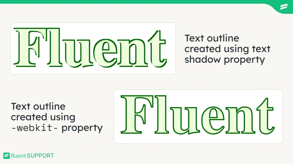
Using the text-stroke Property
For this method, we will use -webkit- property. Before we get into that, a question should arise.
What is webkit in CSS?
WebKit is a layout engine designed by Apple and used by browsers like Safari and Chrome to interpret and display Cascading Style Sheets (CSS) code.
For the outline, the webkit has a -webkit-text-stroke-width property, and for the color of the stroke, we will use -webkit-text-stroke-color property in CSS. Here is the output.
See the Pen Text outline by Webkit v-1 by Ariful Basher (@abir-auth) on CodePen.
It becomes two lines of code instead of four, so it’s already well optimized. But it can be even one line using the -webkit-text-stroke property. Here is the output.
See the Pen Text outline by Webkit v-2 by Ariful Basher (@abir-auth) on CodePen.
Even though it’s optimizing the code, it has a little drawback. It might not work on some legacy browsers. Here is the last compatibility report by Caniuse.
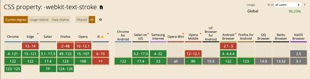
webkit-text-stroke propertyIf your target visitors are still using legacy browsers or less popular browsers, then Webkit might not be a good option. But generally, it’s an uncommon scenario.
Final Thoughts
Either you are using the text shadow method or the Webkit for creating outline text in CSS, try to match the trends and avoid overusing the style on your business site. I am sure your site will be accessible to all kinds of visitors globally, resulting in faster business growth.
Start off with a powerful ticketing system that delivers smooth collaboration right out of the box.
Related Articles
502 Bad Gateway Error: What Is It And How To Fix
If you do not take any steps to…Error Code 520: What It Means and How to Fix It
Error code 520 means Cloudflare got an empty…


Leave a Reply