
Fluent Support 2.0 Beta -1: First look at new UI

By Rasel Siddiqe
January 6, 2026
Last Modified: January 6, 2026


Fluent Support 2.0 Beta -1 is finally ready for you. It is not a theme refresh. It’s not a round of visual tweaks meant to keep things feeling modern.
This release is a ground-up rethink of how the product presents information, how users move through their daily workflows, and how design supports speed, accuracy, and confidence inside a support system that teams live in for hours every day.
This post explains why we redesigned Fluent Support, what actually changed in this beta, and what to expect in the stable version 2.0.
What’s new in Fluent Support 2.0 Beta -1
The easiest way to misunderstand Fluent Support 2.0 Beta -1 is to call it a cosmetic update. That assumption usually comes from associating UI work with colors, typography, or layout alone. None of those things are the point here.
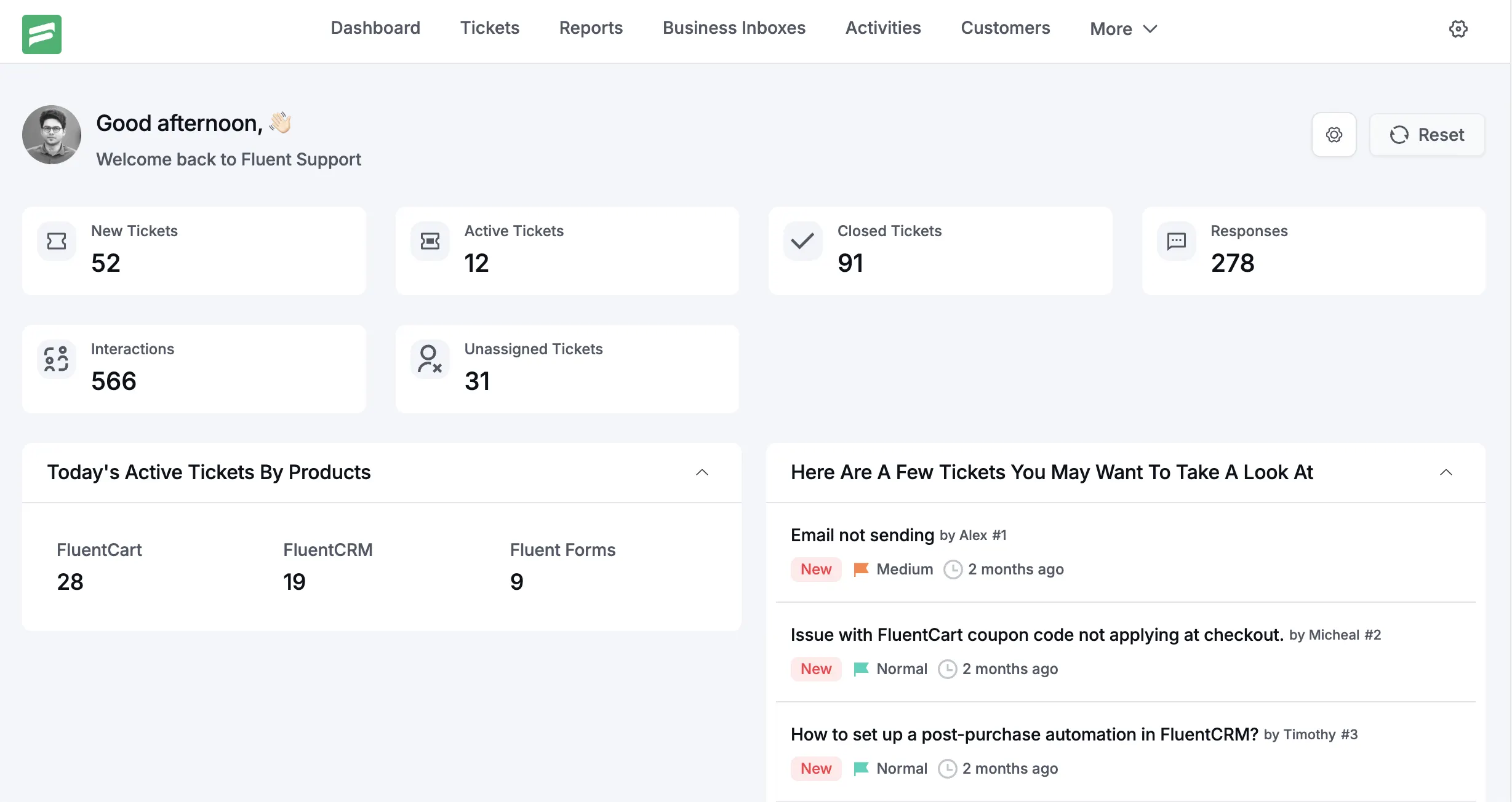
Version 2.0 is meant to be a full UI and UX overhaul focused on structural clarity, consistency, and usability. The surface looks cleaner, but the deeper change is how information is organized, how predictable the interface feels, and how little effort it takes to understand what matters at any given moment.
The plugin does not introduce new ticket types, new automation rules, or new business logic. This is a deliberate choice. A redesign of this scale should not compete for attention with functional expansion. Instead, the goal was to remove friction that had quietly accumulated over years of growth.
Support software succeeds when it disappears. When agents stop thinking about where things are, how to get to them, or whether clicking something will behave the way they expect.
Fluent Support 2.0 Beta -1 moves the product closer to that state.
At a high level, this new update includes:
- A fully restructured ticket dashboard with clearer hierarchy and intent.
- Consistent UI interactions across all screens and components.
- Standardized iconography and contextual tooltips.
- Cleaner data presentation powered by reworked APIs.
- Brand alignment that reflects where Fluent products are going.
Every one of these changes ties back to the same design philosophy: precision over decoration, consistency over novelty, and long-term usability over visual flair.
Why a redesign was necessary
Fluent Support has been in active use for years. During that time, features were added carefully, based on real-world needs. Compared to the leaps made in functionality the UI remains fairly unchanged except a complete redesign of the Customer Portal Dashboard. The customer portal now supports Block based customizations.
That approach kept the product practical, but it came with costs.
The interface relied on Element UI to a minimal extent, but even minimal dependency brings inherited patterns. Over time, those patterns mixed with custom components, edge-case layouts, and feature-specific decisions.
Individually, none of them were wrong. Collectively, they created inconsistency.
User feedback reflected this clearly. Not complaints about missing features, but about friction. Things taking longer than expected. Screens feeling dense. Actions not being obvious at first glance. New users comparing Fluent Support to HelpScout or Zendesk and assuming complexity where none actually existed.
This mattered more than it might seem.
One of the biggest psychological barriers when switching support tools is the learning curve. Teams hesitate to move not because their current tool is perfect, but because retraining feels risky. A complex UI reinforces that fear, even if the underlying workflow is simpler.
The redesign was necessary to remove that perception gap.
Fluent Support has always been fast, flexible, and scalable. What it needed was an interface that communicated those qualities immediately, without explanation, onboarding videos, or mental adjustment.
The design team approached this not as a visual exercise, but as a structural one. The question was never “How should this look?” It was “What does the user need to understand right now, and how quickly can we make that obvious?”
Testing Fluent Support v2.0.0 Beta -1
How to Test the Beta Version of Fluent Support
Testing a beta release is not just about clicking buttons or installing a plugin. It is about validating real workflows, stress testing features in practical environments, and helping us identify edge cases before a stable release reaches production sites. To make this process simple and predictable, we have introduced a dedicated testing utility called Fluent Toolkit.
Fluent Toolkit is designed to centralize all beta distributions for Fluent products and remove the usual friction of manual uploads, mismatched versions, or incomplete test setups. If you have ever tested WordPress plugins before, this flow will feel familiar. If you are new to beta testing, the steps below will guide you safely from start to finish.
This section explains exactly how to access, install, and test Fluent Support beta and Fluent Support Pro beta builds using Fluent Toolkit.
Step 1: Download the Fluent Toolkit Plugin
To begin beta testing, you first need to install the Fluent Toolkit plugin on your WordPress site.
You can download the plugin directly from the official WPManageNinja distribution source:
Download URL:
https://wpmanageninja.s3.amazonaws.com/fluent-toolkit.zip
This plugin is lightweight and does not interfere with your existing plugins or themes. Its only purpose is to act as a controlled gateway for beta installations, updates, and testing.
Important note:
We strongly recommend using a staging site, local environment, or a non production WordPress installation when testing beta software. Beta builds may include experimental changes, incomplete UI elements, or internal logic adjustments that are not yet finalized.
Step 2: Install Fluent Toolkit in WordPress
Once the ZIP file is downloaded, install it like any standard WordPress plugin.
- Log in to your WordPress admin dashboard
- Navigate to Plugins → Add New
- Click Upload Plugin at the top
- Select the
fluent-toolkit.zipfile you downloaded - Click Install Now
- Activate the plugin after installation completes
After activation, Fluent Toolkit will register itself in the WordPress admin menu. There is no additional configuration required at this stage.
The plugin does not collect data, modify settings, or activate any beta builds automatically. Everything remains fully under your control.
Step 3: Access the Fluent Toolkit Dashboard
Once Fluent Toolkit is active, you will find it in your WordPress admin sidebar.
Navigate to:
Dashboard → Fluent Toolkit
This opens the Fluent Toolkit control panel, which acts as a central hub for all available beta builds across Fluent products.
The interface is intentionally minimal. You will see a clear, structured list of available beta versions for:
- Fluent Support (Free Beta)
- Fluent Support Pro (Beta)
Each item is clearly labeled so you always know which version you are installing and testing.
Step 4: Install and Activate the Beta Version
From the Fluent Toolkit dashboard, you can install beta versions directly without uploading files or replacing existing plugins manually.
Here is how the flow works:
- Locate the Fluent Support or Fluent Support Pro beta version in the list
- Click the install or activate button next to the version you want to test
- Fluent Toolkit handles the download, installation, and activation automatically
If you already have a stable version of Fluent Support installed, the beta version will replace it cleanly. You do not need to deactivate the stable version first.
For Pro users, make sure your license is active before testing Pro beta builds. Licensing behavior in beta versions follows the same rules as stable releases.
Step 5: Start Testing Real Use Cases
After installation, your site is now running the beta version of Fluent Support or Fluent Support Pro.
This is where meaningful testing begins.
We encourage testers to focus on real scenarios rather than isolated clicks. Some examples include:
- Creating and replying to tickets using actual customer workflows
- Testing automation rules, triggers, and conditions
- Checking email notifications, assignments, and status changes
- Verifying integrations with other plugins or services
- Reviewing UI changes for clarity, spacing, and usability
- Monitoring performance on larger ticket volumes
If you are upgrading from an existing version, pay special attention to data consistency. Ticket history, customer profiles, and agent permissions should behave exactly as expected.
Design philosophy behind Fluent Support 2.0 Beta -1
Everything in version 2.0 is grounded in structural clarity and visual discipline. That is not a slogan. It is a working constraint.
Precision and consistency
A strict 4-point grid system is applied across the interface. This governs spacing, alignment, and component sizing. The benefit is not aesthetic symmetry. The benefit is predictability.
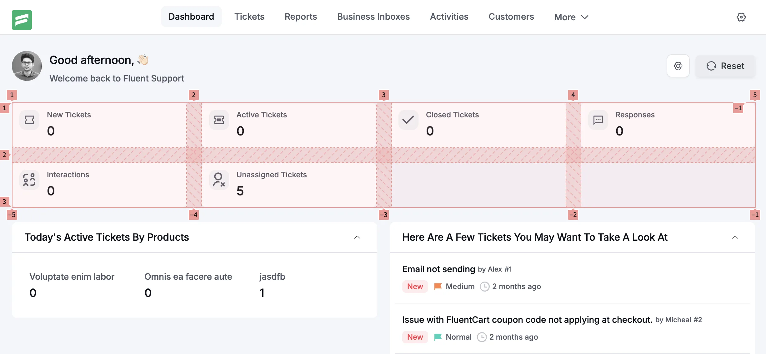
When spacing is predictable, the eye works less. With consistent alignment, scanning becomes faster. When components behave the same way everywhere, users stop relearning the interface on every screen.
This precision reduces visual noise. Nothing competes unnecessarily for attention. The interface feels calm, even under heavy workloads.
Minimalism here is functional, not stylistic. Elements exist because they support a task. If something does not help users process information or take action, it does not belong on the screen.
Seamless responsiveness
Responsiveness is treated as a foundational requirement, not an enhancement. Whether accessed on a large desktop display or a smaller laptop screen, the experience remains consistent in quality and clarity.
Layouts adapt without collapsing meaning. Information hierarchy is preserved across breakpoints. This matters because support work does not happen in ideal conditions. Agents switch devices. Managers review reports on the go. The interface needs to hold up everywhere.
Some smaller or unique resolutions haven’t been tested for and may see some inconsistant behaviour. We plan to solve these with the following updates as we get real-world customer feedback.
Intuitive usability
Usability is the primary metric of success. If a feature requires explanation, the design has already failed.
Navigation is intentionally simple. Critical actions are always close to where decisions are made. Related information is grouped logically, not scattered across panels or tabs.
The goal was to drastically reduce cognitive load. Users should spend their attention on customers, not on the interface.
The same idea came into play with introducing colors to the ticket dashboard. Our own customer support agents chimed in to say “Ticket dashboard is where we spend the longest time, and flashy high contrast colors are going to make the dashboard hard to focus on over long periods of work.”
Hence, the dashboard uses minimal color and the overall interface is centred around a grey-white color palette for comfort on long usage periods.
Visual consistency
A restrained color palette reinforces hierarchy rather than decoration. Color is used to signal state, priority, and action, not personality.
Ecosystem integration
Fluent Support does not exist in isolation. It is part of the WPManageNinja ecosystem.
The interface aligns with WordPress core patterns and with other Fluent products. This familiarity reduces friction when users move between tools. It also allows design improvements in one product to inform others.
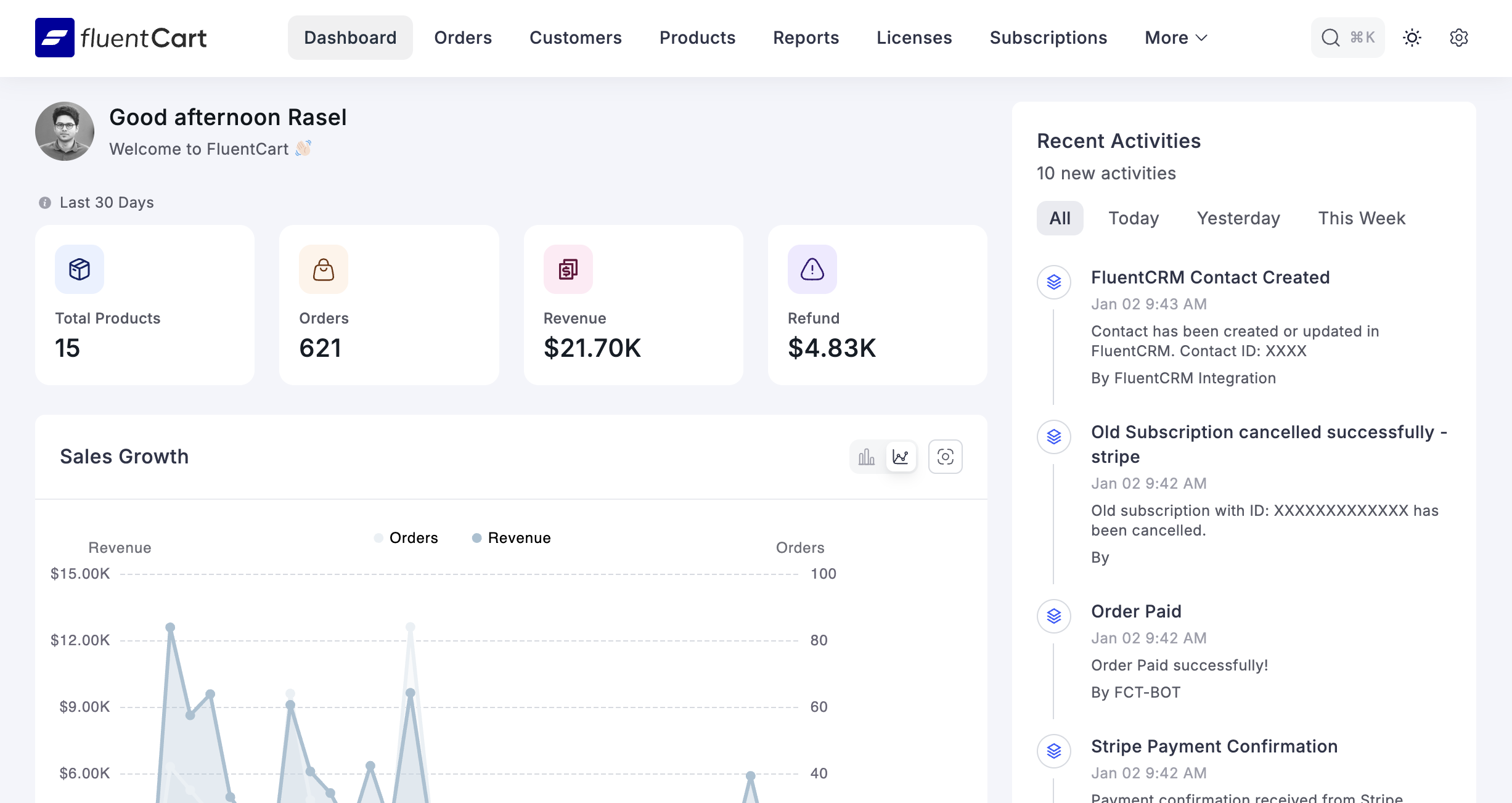
FluentCart served as a key reference point. FluentForms has already undergone its own UI evolution. Fluent CRM is next. Fluent Support 2.0 is one part of a broader, deliberate shift toward a unified product experience.
Key differences at a glance
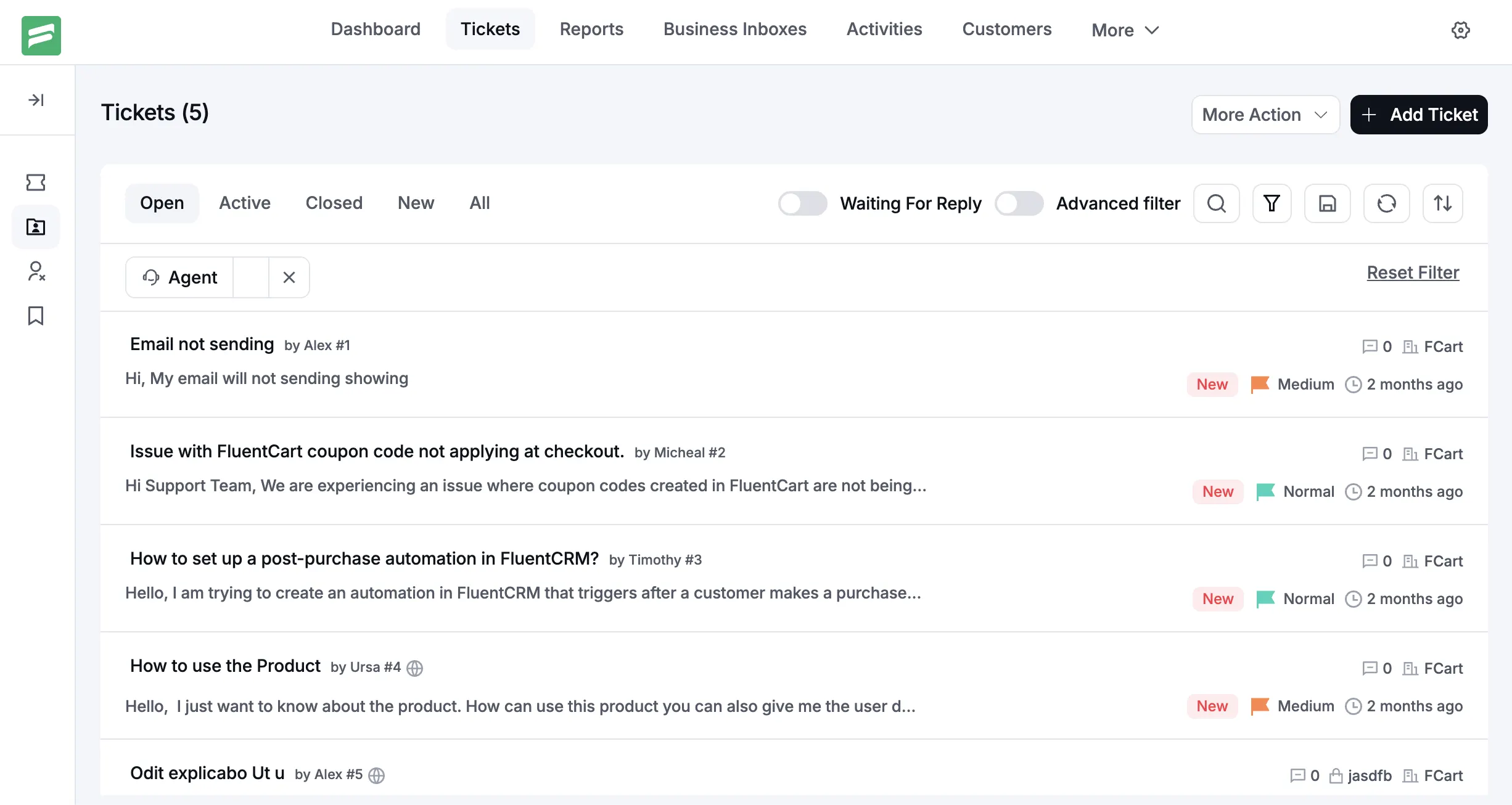
A more organized ticket dashboard
The ticket dashboard is where most users spend their time. In version 2.0, it has been restructured to emphasize clarity and intent.
Information density is controlled. Primary details stand out. Secondary information is present but does not compete for attention. The layout supports fast scanning without sacrificing depth.
The result is not fewer features, but clearer ones.
More consistent UI interactions
Buttons behave the same way everywhere. Dropdowns follow the same interaction model. Modals open, close, and respond consistently across contexts.
This consistency builds trust. Users know what will happen before they click.
Tooltips and standardized iconography
Icons are now standardized across the interface. Each icon has a single meaning, used consistently.
Tooltips provide context where needed, without cluttering the interface. They support discovery without turning the UI into documentation.
Reworked APIs and better data display
Under the hood, APIs have been reworked to support cleaner data presentation and improved programmatic access.
This enables better reporting displays now and unlocks more advanced data views in upcoming updates. The reporting module is actively being upgraded to include more data and clearer visualizations, which will arrive after this major release.
Branding and product alignment
Branding has been refined to reflect where Fluent Support fits within the Fluent ecosystem.
This is not about logos or colors alone. It is about tone, structure, and interaction style. Fluent Support now feels like a natural sibling to FluentCart and FluentForms, not a separate lineage.
The bigger picture
Fluent Support 2.0 is not an endpoint. It is a foundation.
By establishing strict structural rules, consistent interaction patterns, and a clear design language, we have created room for the product to grow without becoming chaotic again.
Future features will sit on a system designed to support them. Reports will become richer without becoming overwhelming. Automation will expand without fragmenting the interface.
Most importantly, Fluent Support will continue to feel approachable, even as it scales.
This redesign is about respect for the user’s time and attention. Support work is already demanding. The interface should not add to that burden.
That is the real value of Fluent Support 2.0.
Related Articles
What Is Customer Profiling and Why Does It Matter More Than You Think
Most businesses collect customer data. Very few actually…Is “AI Brain Fry” Burning Out Your Support Team?
AI brain fry is a new form of…


Leave a Reply