10 Tips to Make a Website Customers Love

By Rasel Siddiqe
May 13, 2022
Last Modified: February 20, 2024


Websites have become a thing that you don’t even think about twice. It takes very little for the average Joe to launch a website and make money out of it. However, launching a website that customers love is easier said than done.
In this article, we’re going to look at tips for a website your customers will love and appreciate. But before we get into the details let’s check out what customers expect from a website in the first place.
What customers want?
A website is where people visit to learn more about you or your business. But that’s not at all enough. A website reflects the taste and philosophy of your business too. So it’s more than just information. It’s a journey. So customers expect a smooth experience. Hence your visitors will also expect,
Friendly UI
User experience is the most important part of your website. If it’s creatively intriguing, visitors tend to remember the experience better. Friendly UI includes,
- Easy navigation
- Readable Fonts and Colors
- Visual Hierarchy
- Beautiful design
AI website builders can play a crucial role in achieving a user-friendly interface. They automate design processes, ensuring consistency and adapting to evolving user preferences.
Mobile compatibility
51% of all web traffic was generated from mobile devices in 2021-22. If you’re not optimizing your website for mobile devices you’re losing a lot of potential audiences. Not only that, Google puts a lot of emphasis on mobile-friendliness. So not making websites cross-compatible makes them less likely to impress Google too.
Up-to-date information
Visitors come to your website because they need some sort of information. Because of that, you need to keep your site up-to-date with all the necessary information. Hosting outdated information on your website can create confusion you really don’t want to deal with.
10 tips for a website customers love
Since we’ve covered what visitors expect from a website, let’s get on with how to make a website customers love.
Design tips
A killer website is one that takes the driver’s seat of your audience’s attention. To make a website customers love you should apply the following methods.
Large headers
Every piece of content that you put on your website doesn’t have the same gravity. Your audience needs to clearly grasp what’s what. Headers are a standard way to do this. Large headers on your website should ideally feature concise text.
Large headers are meant to grab a user’s gaze and then direct it towards the following steps. However, it’s not just about fancy colors and fonts. Otherwise, this would be an awesome website today.
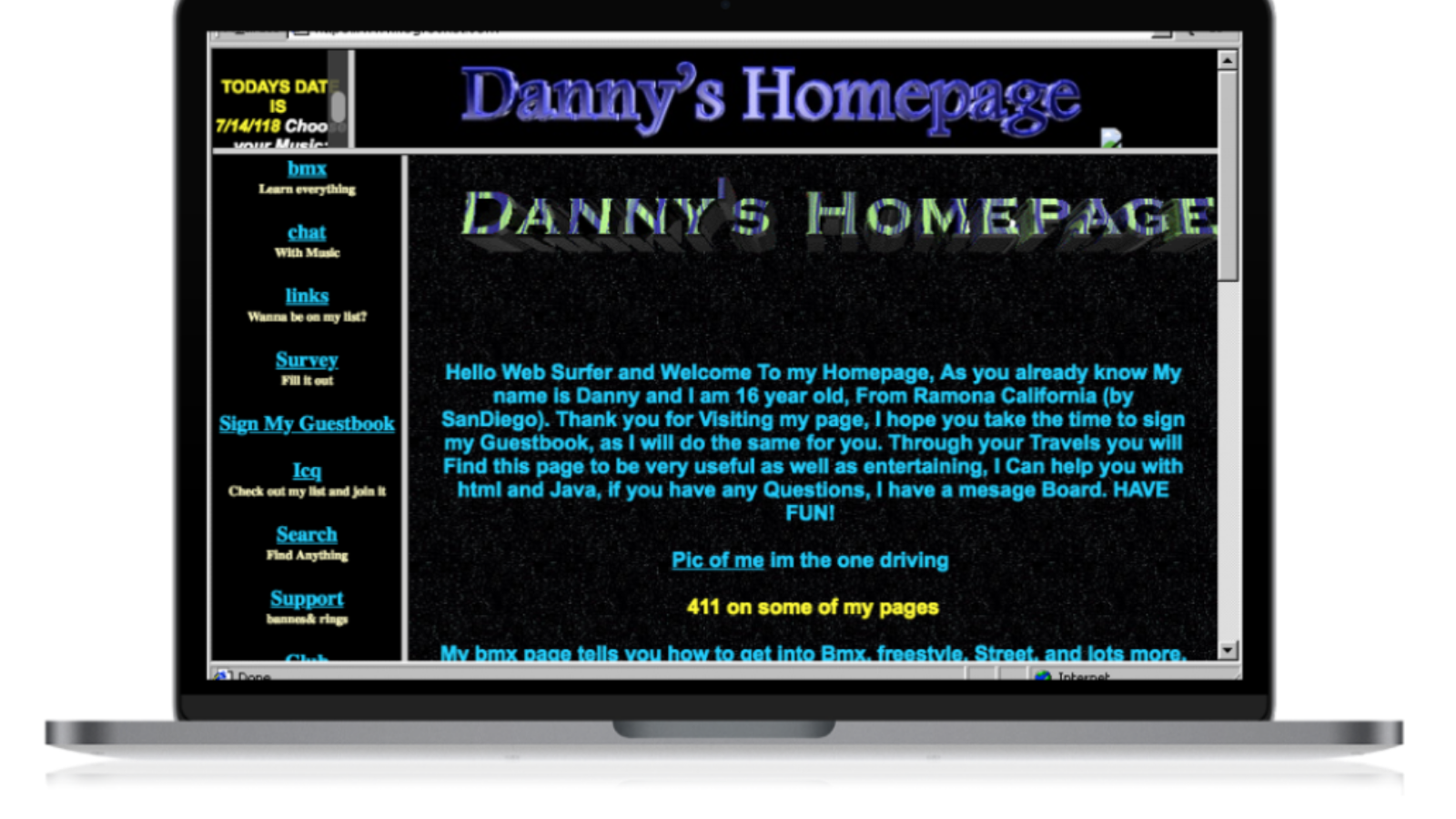
While we have nothing against the retro aesthetic, we’re glad it’s not the norm anymore.
Very unlike Danny here, we’d recommend using clean fonts and appropriate font colors for large headers.
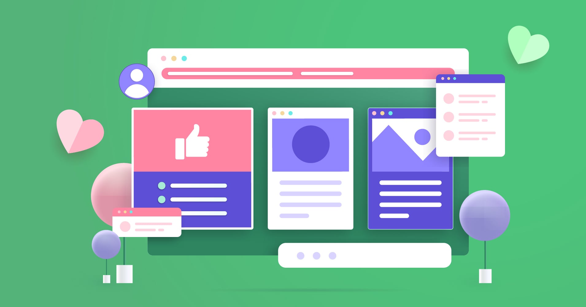
Bonus tip: Try to maintain the hierarchy in your heading distribution as shown. This not only helps your audience but also helps search engines crawl your site better.
Colors
Colors can honestly make or break your website. If your goal is to hold your audience’s attention as long as possible, the colors you choose can be your best friend or your worst enemy. We understand that colors also carry importance for branding purposes. You should definitely keep those things for the sake of your business. That being said, there are cardinal sins that you just can’t get away with.
For instance, if your website looks like something along the lines of this you’ve already lost at the game.
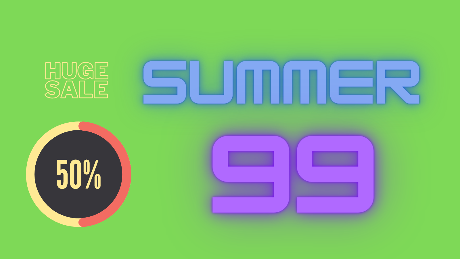
Too much is going on in this image that distracts the user and makes them rethink their decision to do business with you.
The goals when choosing colors for your website are,
- Stick with a 3/4 color palette and keep it simple
- Consider the context when choosing contrasting colors
- Prioritize visibility at all times
In contrast, check out Fluent Form’s clear skies aesthetic they stuck to throughout the website.
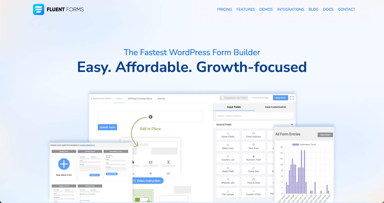
Why is it an effective website design?
For one it’s clean and has almost zero color conflict. The combination is easy on the eyes and will not burn out users if they decide to stare at it. Feel free to check out their whole website for better ideas.
Size and position
Last but not the least is size and position of content on the page. Font size denotes the hierarchy and flow of text going from larger to smaller. So make sure highlight text content is in large fonts while less important details can be in a normal paragraph.
Regarding positioning, it’s essential to place things as you want your users to view them. Header texts need to be at the top, while subscription CTA should be at the end. These are the basics.
Your navigation bar and other important links can be placed either at the top or at the bottom. Having distracting links in the middle of your homepage is just a poor design choice. Alignment is just as important.
As a rule of thumb, put large headers in center alignment. For paragraphs and tables orienting to the left or right is good practice. Not everything needs to be the center of attention.
Information tips
Now that we’ve covered what to prioritize in your website’s design, it’s time for what your website needs to contain. As we’ve already discussed, visitors to your site are usually looking for something. It could be to get your contact info, check out your offerings, or compare with other competitors. It’s absolutely essential that you provide these on your website and that too somewhere easy to find them.
Contact information
First off, it’s your contact information. When adding contact information you need to make sure it’s
- Correct
- Up-to-date
- Easily comprehensible
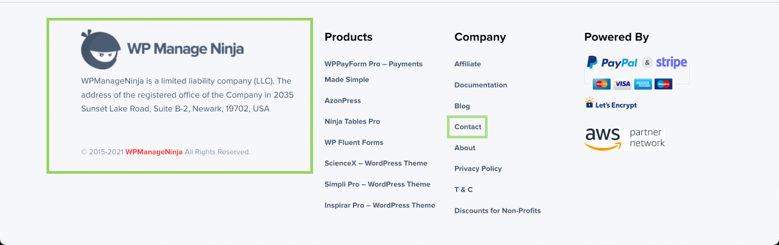
With regards to placement, you need to show contact information on a readily accessible page. A good way is to offer an “About Us” or “Contacts” page to store and host this information and have a link to it on your homepage and other landing pages.
Making customers look for contact information can have some serious consequences for your website’s impression. Keeping it easy to find is by far the best strategy.
WPManageNinja for example is keeping it simple and easy to find.
Data organization
No matter the kind of website, you’ll always have information that isn’t really text-based. Like product catalogs on E-commerce websites. Making customers view products on individual pages is the last thing you’d want. Instead, you’d want a nice clean table to create your product catalog.
How you organize things on your website matters!
Same thing applies to comparisons, official notices, and what not. Instead of fiddling with HTML and CSS to create tables manually, you should get a tool that does it for you. Take our comparison table built with Ninja Tables.
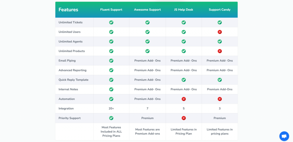
All of the customization that you see, like colors and layout, is done with Ninja Tables.
This table is an efficiency trick to showcase a large amount of information in an organized interface. Your visitors will thank you for saving their time and effort to check out your site.
Blogs and resources
The other thing visitors expect is a blog or a resources section. Blogs and resources are meant to offer visitors a look at what your business is all about. The resources section is more or less dedicated to current and prospective customers. Resources usually include newsletters, tutorials, user manuals, etc.
Blogs on the other hand showcase what your website (or, business) is all about. This is where you get to start up conversations with visitors. Not to mention it helps to establish your authority on the subject matter.
Tips:
- Make sure the section is easily navigable
- Keep the content relevant
- Encourage feedback and subscription
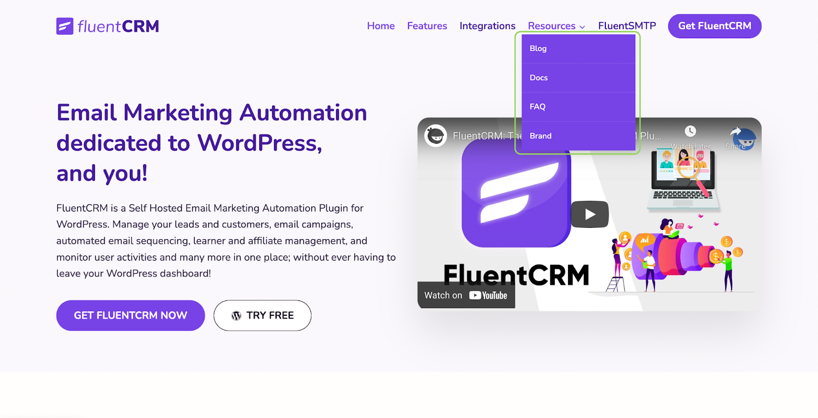
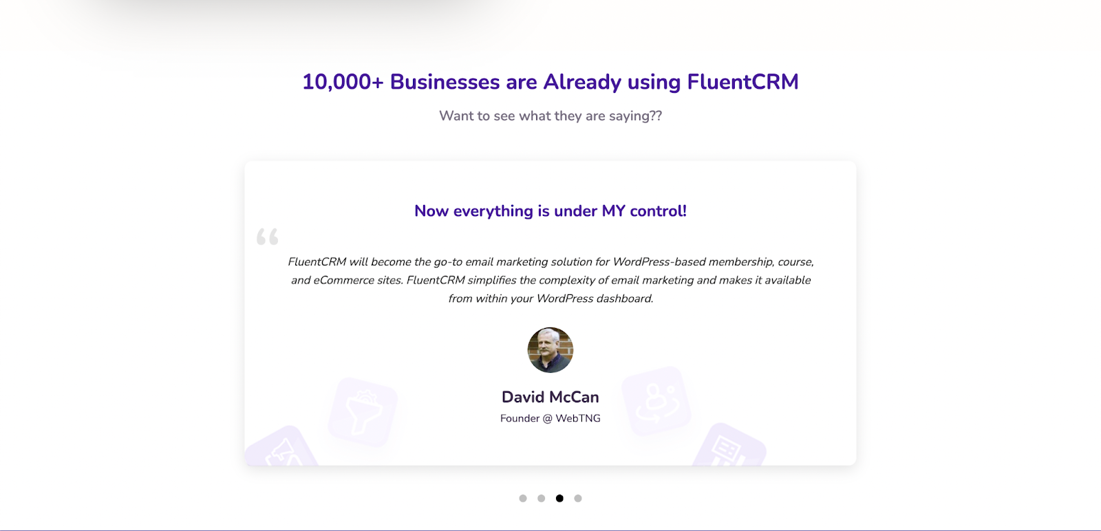
Check out FluentCRM for how to do this on your website.
Social proof
Another must-have on your website is social proof for all the activities that you are associated with. This makes it easier for visitors to place your brand in the right place. Social proof can be gathered from a number of places, for instance,
Social media: Facebook, Twitter, Instagram, Linkedin.
Marketplaces: WordPress, AliExpress, Amazon.
You can gather reviews from these websites for your business and feature them on your own site.
Having social proof readily available for visitors reflects authenticity and reliability. When choosing and displaying reviews, things to keep in mind are,
- Include the source for the review if it’s from a third-party website.
- Refrain from sharing information and remarks that the original reviewer didn’t provide
- Seek permission before taking reviews from closed communities and groups
Here’s how FluentCRM is making the most of its reviews,
Psychological reinforcement
Things we’ve covered up to this point will help you create a website that does its job. But there’s still a psychological element too that needs attention. Let’s look at it this way, when you’re reading or watching a video, what makes you finish it? Why don’t we just drop it after the first few pages or minutes?
The answer to this is the content must have some sort of innate ability to hold and drive your attention forward. Usually, towards a resolution you want your audience to arrive on. Without this ability, no content will achieve its goal.
Your website is no different. To keep people on your site it needs to drive the visitors towards a relatable outcome. Researchers have found some clear psychological strategies that can improve visitor retention and overall user experience. We’ll look at some of the most obvious and effective ones that make a website customers will love.
Beyond the fold
“The fold” is a term used to define the first section of your webpage that is visible to the user without having to scroll. Back in the early days, webmasters considered driving users beyond the fold on websites a rather difficult task. This was true to the point a whole new web design philosophy emerged where everything important had to be within the fold.
However, today this has changed completely. Extensive research over the years has shown that the fold is not a barrier that is hard to cross. Site visitors happily scroll through pages as long as the content and layout are of some standard.
Hence “the fold” isn’t a viable concept anymore. If your web content is effective and the design is on point, users will scroll.
Here’s how WP Social Ninja does it,
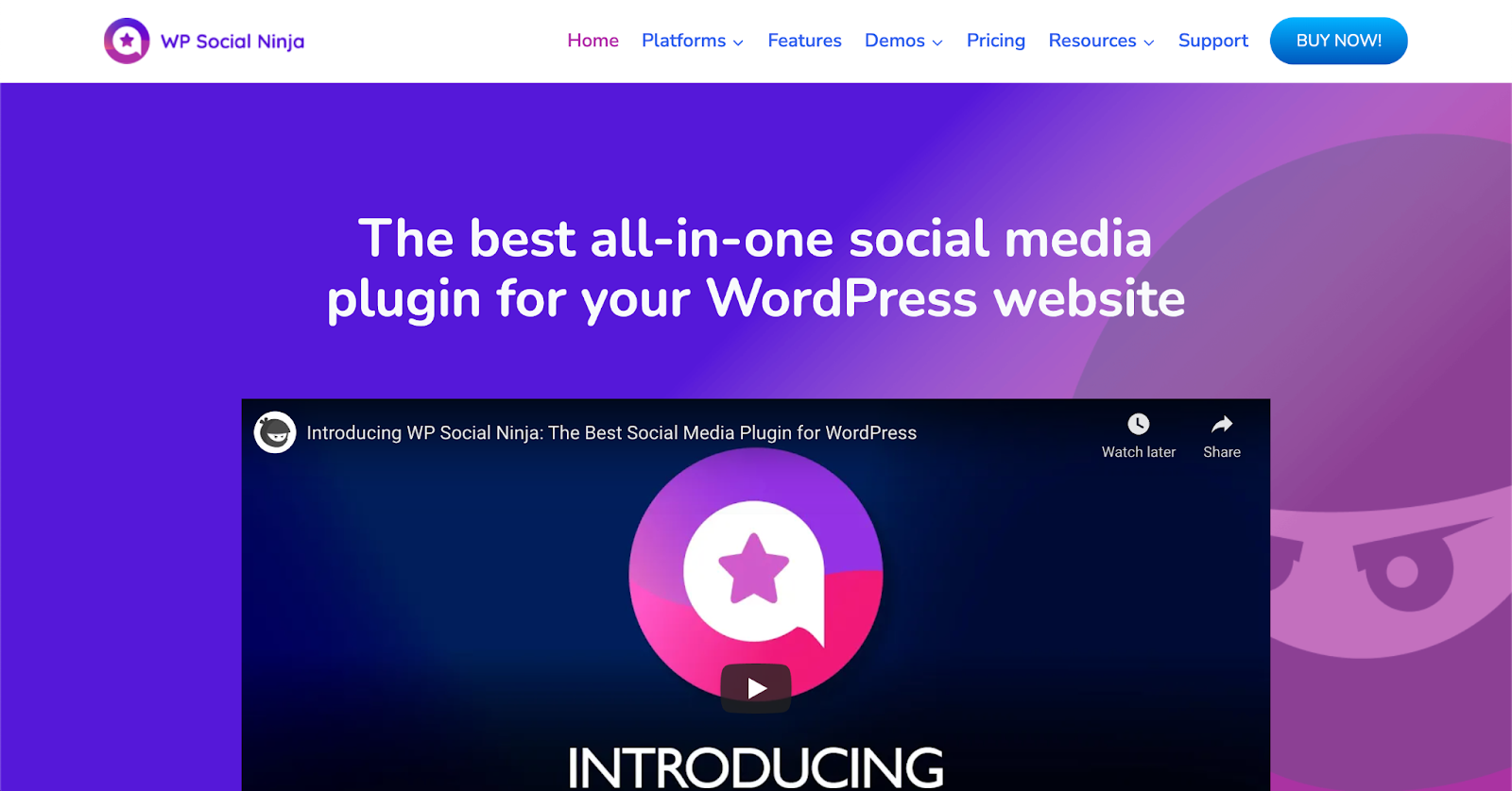
They’ve embedded a video on their homepage that seems to fall off the screen. So, you read the header and then to watch the video you’d have to scroll down. Let’s see what happens when we do that,
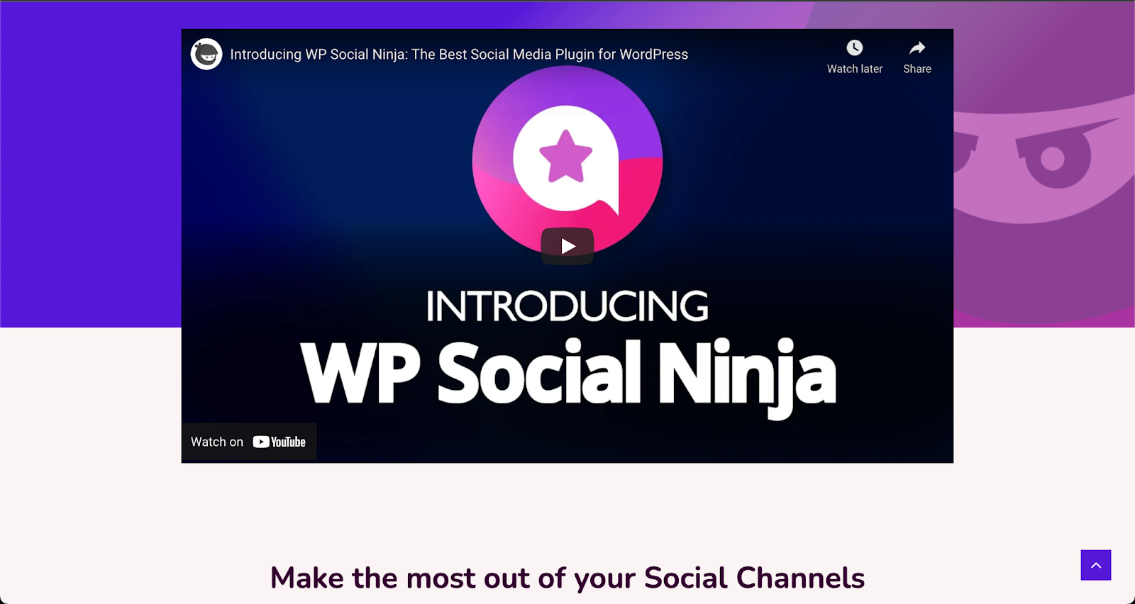
This shows another line at the bottom that leads you into the next section of the site. This is what going beyond the fold looks like when done right.
Directional cues
Directional cues are essential to keep the visitor’s attention where you want it to be. The psychology behind it is quite interesting in its own right. Humans are tuned to follow the gaze of others around them. We use the linear gaze to determine what a person is looking at by looking at it ourselves.
While it’s true even for pictures of people, it also works for arrows and other visual aids. Users follow these directions involuntarily so your design choices will rarely misfire. Directional cues can be both explicit such as lines, arrows, and object placement, also implicit such as white space and contrasting colors.
Limit interactions
Websites are not the same as written content. One way that’s true is websites are way more interactive. A well-designed website not only hosts information but gives visitors a chance to interact and actively engage with it.
A very common interaction in this context is comment boxes, subscription forms, and sales CTA’s. These are the activities you want visitors to engage in on your site.
The trick is to limit the maximum number of these elements on a webpage. You don’t want to overwhelm a visitor’s attention span. As much as it’s good to give options, too many of them can freeze the visitor. This leads to poor conversion and click-through rates.
Humans aren’t good at handling endless possibilities. As Sheena Iyengar and Mark Lepper from Columbia and Stanford University demonstrated, limited choices induce purchase decisions 6 times more often compared to an abundance of options.
This applies to website interactions too! The more choices visitors see on your website the less likely they are to pick any of them.
For this one, we’ll check out our own homepage layout.
As you can see in the site we included only one CTA at the very end of our homepage. The basic rule here is not to put multiple CTA that compete with each other for the visitor’s attention.
We also kept the design linear by making each section lead up to the next one. This ensures if one particular section intrigues a visitor they can keep scrolling, while other CTA’s don’t compete for their attention.
You can apply this on your website to keep the design-friendly for your visitors and effective for your business.
Wrapping up
So that’s it, folks. We’ve covered 10 killer tips for a website that your visitors will love. Almost all design professionals adhere to these rules in one way or another. While each tip will improve one aspect of your site, all of them together will make up a website customers love. Go ahead and check out if your site is making the best of these. If not, you know where to find us for the best tips!
Until next time, happy serving!
Start off with a powerful ticketing system that delivers smooth collaboration right out of the box.
Related Articles
Customer Service Training: Skills, Types, and How to Build a Program
Your support team is the part of your…Introducing FluentPlayer: The Video Player for WordPress Built to Convert
FluentPlayer is a native video player for WordPress…
Leave a Reply